Genesis 2:7 (NLT)
"Then the Lord God formed the man from the dust of the ground. He breathed the breath of life into the man’s nostrils, and the man became a living person."

Art carries something that does not fade. It carries the mark of its creator...life has been breathed into it. Art is imbued with this life by its creator - in creating art, we imitate our Creator who first breathed life into us.

Monday, 2 December 2013

5th Grade Project: Ocean Impressionism

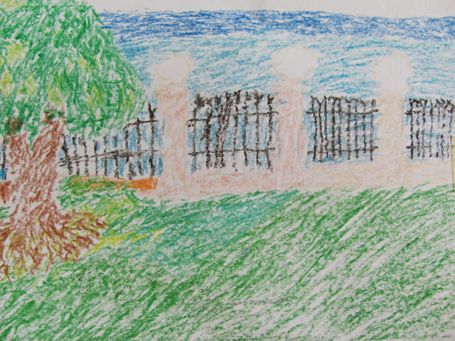
The 5th grade continued its study of Impressionism by going outside during three different class periods to create an impressionist ocean scene.  The students used crayons to imitate the impressionistic style of many small marks to create a larger image.  At first the idea of an entire ocean scene with no preliminary sketch seemed to intimidate the students, though they quickly relaxed as they saw their work come together.


We focused on light and shadow, and on showing colors accurately.  Students would show the varieties of green in a tree's foliage, or in a patch of grass.  Once this level of observation was made the quality of the work rose quickly, so much so in fact that one of the classes asked to restart the project completely to better show what they saw.


Even using crayons the students were able to imitate the style well, producing very painterly results.  We will move on further into Impressionism by using watercolors next.  To be continued...


Thursday, 28 November 2013

6th Grade Project: Op Art - Circles, Lines, and Curves (Part Two)

The 6th graders are currently finishing their Op Art pieces.  These have taken awhile, but the results are worth the wait and the effort.  These kind of posts run the risk of being lengthy because I want to show off all the great work that has been going on in my classroom.

Students were able to choose their color schemes.  Some stayed with the black and white, while others decided to use a larger palette.


Return to Op Art: Part One


Monday, 25 November 2013

4th Grade Project: Georgia O'Keeffe and Abstract Art

We began our study by answering the question: What is Abstract Art?

Students then learned about Abstract Art being not realistic.  Many things can be abstracted: people, places, things, even ideas can be shown in ways that are different than they would be in the real world.

Now that students understood what Abstract Art was, we moved into our study of Georgia O'Keeffe and her monumental images.  We looked through a collection of her paintings, especially highlighting the flowers and bone images she is famous for.  Her zoomed in flowers took on an almost abstract look, students did not recognize that the images were indeed flowers.

We then made our viewframes so that we too could zoom in on everyday objects, composing monumental images.


With our viewframes made, we were able to move about and use them to help us compose our drawing.


When we completed our realistic drawings we then began the abstraction process.  In this process realistic, natural shapes changed into geometric abstract shapes.


Natural colors did not have to be used either, so students happily chose their own colors for their images.


7th Grade Project: Impasto and "The Starry Night" (Part Three)

After weeks of work, the 7th graders are finished with their Van Gogh Starry Night pieces!  The results are beautiful, enjoy.


This post could be very long, but I will stop at three images.  These students did a wonderful job, I am so impressed by their work and craftsmanship on this project.  They imitated Van Gogh's style very faithfully, though it required extra work and time.  What a joy it was to watch this process unfold and build into this fitting finale.  

Go to:  Van Gogh: Part One

1st Grade Project: Peacock of India

Since our 1st graders study India we do an art project with India's national bird - the peacock.

In our study of the peacock, we discuss both specifics about the bird and its appearance, as well as its significance to India.


We began by drawing our peacocks together.  We worked with our long lines and curving lines to create the feathers and the body, we then used small shapes for our details like the beak and eyes.


Once drawn, we outlined our peacocks with black crayon to prepare us for our painting.


We then move into painting coloring our peacocks.  The bodies of the birds are colored with pastel, the feathers and background are painted with watercolor.  


We then created the "eyes" or circles at the ends of the peacock feather.  These dots are drawn on separate paper then cut out and glued onto our peacocks.  


Once the eyes are colored (using crayons) and cut out, they are glued onto our peacock.  Students then can add their own decorations or backgrounds into their artwork after this last step.


Monday, 11 November 2013

8th Grade Project: Value Unit 2 - Still Life Value Study

The 8th grade continued into their value unit by showing the values they perceived on a monochromatic still-life.  They used the value charts we had created previously to help them with the value scales.

See our Value Chart blog post.


In these still-lives, students were asked to focus on the different specific values found in each still-life, rather than painting the still-life.  In representing these values they could build their still-life, showing the correct value in the shape or plane that they see it.  As they added more values and more planes, their paintings became more detailed, better representing the still-life they were painting.


We worked on this project for two class periods.  The results were extremely pleasing.  The students were a bit intimidated at first but as they began their work, they discovered that they were well-equipped for the task having already cultivated their abilities to perceive and represent value.


Tuesday, 5 November 2013

8th Grade Project: Value Unit 1 - The Value Chart

In this unit the 8th grade begin in a basic study of value, this study will culminate in a painted portrait.

After viewing an introductory video that introduces some new vocabulary and concepts, we delved into our own value charts.  Students not only create the value, they first learn names and locations of the values both on a linear chart as well as an object such as the sphere.


8th Grade Project: Radial Name Design

In our current unit we are learning about symmetry and the different ways things can be symmetrical.  This leads into our symmetrical name design project in which we use radial symmetry.

Beginning in our sketchbooks, we first worked out the way we wanted our names to look.  Having been shown example of radial symmetry and previous name projects, students take into consideration the many options that have in the design of their name.


Once they have completed their two initial designs, they move into the image transfer practice.  This gives students an awareness of the key determining factor in their design:  "How does the image transfer change the overall design?".


Kindergarten Project: The Dot

This project is inspired by Peter H. Reynolds' book "The Dot" which can be found at:
http://www.peterhreynolds.com/dot/


So just like the character Vashti, we began with a dot.  The first dots were cut from colored construction paper.  Our next series of dots were added with crayons.  We then used markers to finish our dot compositions.  So many dots and so many unique ways to use them.  


5th Grade Project: Impressionism and Monet

The 5th grade have begun this unit by viewing a presentation over both Impressionism and Monet.  They have learned that the Impressionist were very interested in the effects of light on their subjects.  Using this as our key point, we moved into our first practice looking at light on our subjects.

Our first subjects are some very shiny plastic toys.  Dividing our sketch page into two halves, we then did a line drawing of the toy.  Students were told to look specifically for the shinier spots on the toys and mark those on their line drawings.  Once this was completed, we began to color.  We used small marks (like the Impressionists did) with crayons to apply color.  Students first colored in the shinier spots then they added their subjects actual color around those shiny spots.

In our second half of our page we only used color to create our drawings, we used no line work or pencils. I encouraged them that this was not about the drawing but the idea of looking at light and color, this took the pressure off of them and they became more ambitious with their experimentation.


The students began to see the Impressionism in their own work, often stopping to view their work from a distance.  This because we use small marks to apply our color lead to a smoother appearance of the colors as you moved back from it.  Though once close to the work you could see the small marks - they particularly enjoyed this aspect of the Impressionism.

2nd Grade Project: Piet Mondrian - Stencils, Colored Pencils, and Neoplasticism


The 2nd graders were introduced to the work of Piet Mondrian.  We viewed our introductory presentation and discussed what made his new "Modern Art" special and different. Highlighting his use of lines, shapes (specifically rectangles and squares) and primary colors; we then began our own work in his style.

To the particular enjoyment of the students, they were introduced to 'boogie woogie'.  Mondrian both enjoyed and was inspired by jazz, so during our project we also listened to jazz.  This again was very enjoyable, to the point where I had not even finished handing our materials on our second day when I was being reminded, "Don't forget the jazz."


Using a square stencil, we overlapped and traced square after square.  We traced a minimum of eight squares, though some of our artists wanted to trace more than that.


Then in the style of Piet Mondrian, we used the primary colors on the rectangles and squares in our compositions, leaving the irregular shapes white.  Some students wanted to use patterns to fill their rectangles and squares, while others opted for the more traditional solid color.


Tuesday, 15 October 2013

3rd & 4th Grade Project: 6 Lines

Our 3rd and 4th grade classes explored using different lines in this project.  We used six lines: straight, wavy, curvy, zig zag, squiggly, and dotted/dashed lines.  We learned that when a line crosses itself it makes a shape.  These shapes created from lines crossing are what gives our project its unique look.

Students used each of the six lines to cross the paper in some way.  Once they used the six lines, they were free to add any additional lines that they wanted to.  After the lines were complete, the students outlined their pencil with either black or colored marker ( student's choice ).

We then went through our designs, coloring all the new unique shapes created by the crossing lines.  We did not cross any lines with our colors.  This gave us some fantastic results.  This project was a favorite of the students.


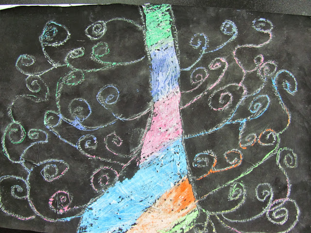
1st & 2nd Grade Project: Tree of Life - Scratch Art

The 1st and 2nd grade both learned about Gustav Klimt and how he loved color.  So using Gustav and his love of color as our inspiration, we first covered our papers in crayon.  We then painted our paper completely black with tempera paint.

Below is a sample to show students what happens when you cover your crayon with black paint.


Once their painting was completed and our papers were ready, we used chalk to draw our 'Trees of Life'.


We then used our scratching tools to remove the black paint from the inside of our trees and the swirls of our trees' limbs.  Some of our students paint was too sticky to remove so they had difficulty with project, it was hard to watch them do so well for all the steps and then not get a satisfactory result.